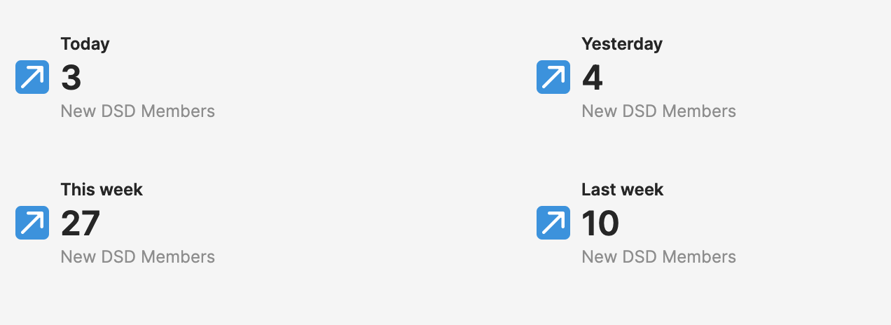
This is our dashboard at deepskydata - To be more precise, a part of it.
It’s our only dashboard. There will be a second one tracking our initiatives, but that’s it. We don’t need more - we are young and laser-focused.
Two dashboards are great for me because I dislike building and maintaining them.
Both dashboards serve two different purposes:
1 - See if deepskydata is ok and moving - we currently focus only on member growth, so that’s what we are looking for—no retention, videos watched, or courses finished, which is all important but for a later stage.
2 - See how our bets are doing. We launch and try new things, smaller and bigger ones. Because we are not god-like, we want to see how the bets are doing. Do they move the needle or not?
So, I really resonated with Benn’s latest edition
when he talks about getting to the basics of insights:
“… we celebrate and reward the “simple” work of creating basic reports and of working with experts around the business…”
(sorry, I took this a bit out of the immediate context, but the meaning stayed how it was written).
Benn was pointing out the kind of ridiculous approach of BI tools to be more than just tools that provide “basic reports.” They want to be platforms for whatever. From a marketing and sales perspective, that makes sense. Who wants to justify the budget for a simple tool when you can get an insights platform that paints a bright future of data enlightenment?
But the problem companies have are not missing insights from data; it starts much earlier.
Most setups of BI platforms are dumpsters of misunderstandings. Between everyone. My favorite is still Metabase, who wanted to make approach data thoughtfully, so they introduced the concept of a question - first, you ask and then generate the results. And everyone later finds these questions and extends them. Most of the Metabase setups I know are a collection of 300+ questions, nothing related, most of them with data issues - in the end, no use for anyone. And, of course, this is not Metabase’s fault (maybe a bit with the question approach). It’s the people and the communication.
As someone much smarter than me pointed it out. Data is:
People > Process > Tools
Looking at this, I have an idea for BI tools: Why not start with the people?
Data and the rest of the business are often relatively isolated from each other. They live on different islands, speaking different dialects and having totally different lives.
Sure, there are multiple ways to improve that. More communication, shared work - classic relationship management - all the things that data teams love to do (skip pipelines for meetings).
But there is an additional way that not many have realized yet (including the tool vendors).
Dashboards are the common interface between data teams and the rest of the company. They are the product of all the pipeline, transformation, testing, and modeling efforts. And they are usually something that the other teams look at regularly.
So why don’t we use this space to improve our communication between data and the rest of the world? Like a trojan horse into the growth, product, sales, and operations teams.
Of course, a dashboard shows some numbers and charts, but why end there?
Let’s take our simple “is deepskydata still moving” dashboard as an example.
Sometimes deepskydata is not moving - numbers don’t change - so nothing happens, or is something broken?
Some extensions:
- Freshness state: when last generated or cached
- Links out to results of e2e tests, tracking logs (quick check if something has failed)
- Or in a v2 - results of these tests are pulled into the database and can be viewed with a click as context sidebar
- Quick ticket generation - when something looks off - we provide a button to generate a “check-up” ticket quickly - when we do a good job, we provide a bunch of context from the data already to the ticket (charts, logs,…)
Or maybe these charts and numbers create plenty of question marks? What do we mean by members? Where does this data come from?
For everyone now googling the data catalog, forget it; it’s not suitable for business teams.
Why not:
- Create and link Loom videos to dashboards - explaining the dashboard itself - or just every metric
- Quick button for people to ask a question about the chart and when implemented - why not have a Q&A part linked to the chart
- Ask the users if they trust this metric or, if not, why not? - So you can generate trust ratings for dashboards.
And maybe these charts are just sparking the creative minds of the viewers.
So let’s give them some space:
- Quickly ask for a different view of a chart (and yes, a cool system could now reference existing versions of this chart)
- Or create a ticket from it asking about the why and what
I think the options are limitless when we leave the path that dashboards are just for numbers but more a starting point for a conversation. And yes, some tools allow comments on dashboards: a good start, but just a start.
And maybe there will be BI tools (platforms) that understand their real power - to support the conversation between data and business teams. To help with the people part of the problem.


It would be so nice if there was a way to collect google analytics-like intelligence on who’s looking at what, and gather data useful for the “UX” team (i.e. analysts / BI people working on the dashboard)
And I couldn’t agree more on the notes about people and process. That’s so deeply true and I hope more BI vendors build solutions that support the whole DataOps lifecycle, in a modular way and not with monoliths that try to vendor-lock-in it all