Digital products need feature analytics to benefit from iteration speed and unbiased feedback.
As a start, let's imagine a product without features. That may not be possible. But for sure, not all features are visible. But they are still features.
And features are the one thing most product and engineering teams think about most of the time. Features are 90% of all the work; sometimes (or even more often), the teams and users go crazy because of them.
Features loved to be listed and compared with the competition (one of the most ridiculous tasks invented). But we still have these feature list pages on almost all Saas websites. And to be honest, I look at them from time to time. Usually, when I have a specific feature in mind and want to check if it is available in the plan I am looking at.
As always, before we jump into any weeds, we should start with some definitions. To have a better-shared understanding, we will look here at features for digital products.
"In the context of product development and marketing, a product feature refers to a specific characteristic or function of a product that provides some benefit or advantage to the user. These features are the individual components and capabilities that make up the product and differentiate it from other products in the market."
From ChatGPT (no Wikipedia definition found)
The function stands out for me, enabling the user to do something. This is important since we want users to do things in our product.
And this is connected with a benefit or an advantage. Or even making progress. This is helpful since we don't develop features for the sake of a feature.
A feature is an individual component. This makes it a bit harder to define. What is a component? We leave it like this for now and come back to this later.
How to define a feature in your product?
From my product experience, there are no clear boundaries to define a feature. Different teams and persons might define features slightly differently by merging or separating features into bigger or smaller ones.
Because there are different levels of features.
My approach is to start with the product entities and then examine the specific actions. And sometimes, from there, identify particular forms of activities if they make a huge difference.
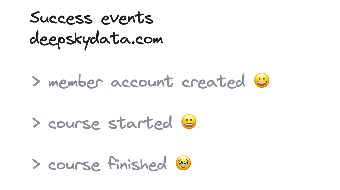
I also like to define how a feature has been used successfully and have a list of feature success events, which is helpful for many things.
To make it more visual for us, we look at some examples.
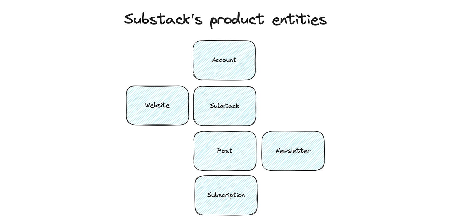
Let's take Substack as our product. What kind of entities do we have?
Account - is the atomic item. You need at least an account to create a substack, but you can also have one without a substack.
A Substack itself might be a feature, but maybe not. This is harder to tell. But it separates the account from a substack. And I can be a member of several substacks. So I would vote to have a Substack as a feature as well. (in product marketing, the feature would be more: multiple substacks).
Website - the website is the visible part for readers where they can find and read new content
Newsletter - we can send our new posts as updates to our subscribers
Subscriptions - works for both sides; you can be my subscriber or subscribe to my substack.
Post - belongs to a Substack and is the core growth entity.
These are the core product entities for me. But we can add some layers under it to investigate them deeper. The deeper levels are a way to create a hierarchy, and there is no right and wrong to it. Sometimes an entity on a precise deeper level than another can become a core entity because it is strategically vital.
Example:
Substack > Dashboard - the dashboard is an important feature but less critical for driving growth. So for me, it is a child entity of a Substack.
Website > Custom Domain - A custom domain is a feature entity connected clearly to the website.
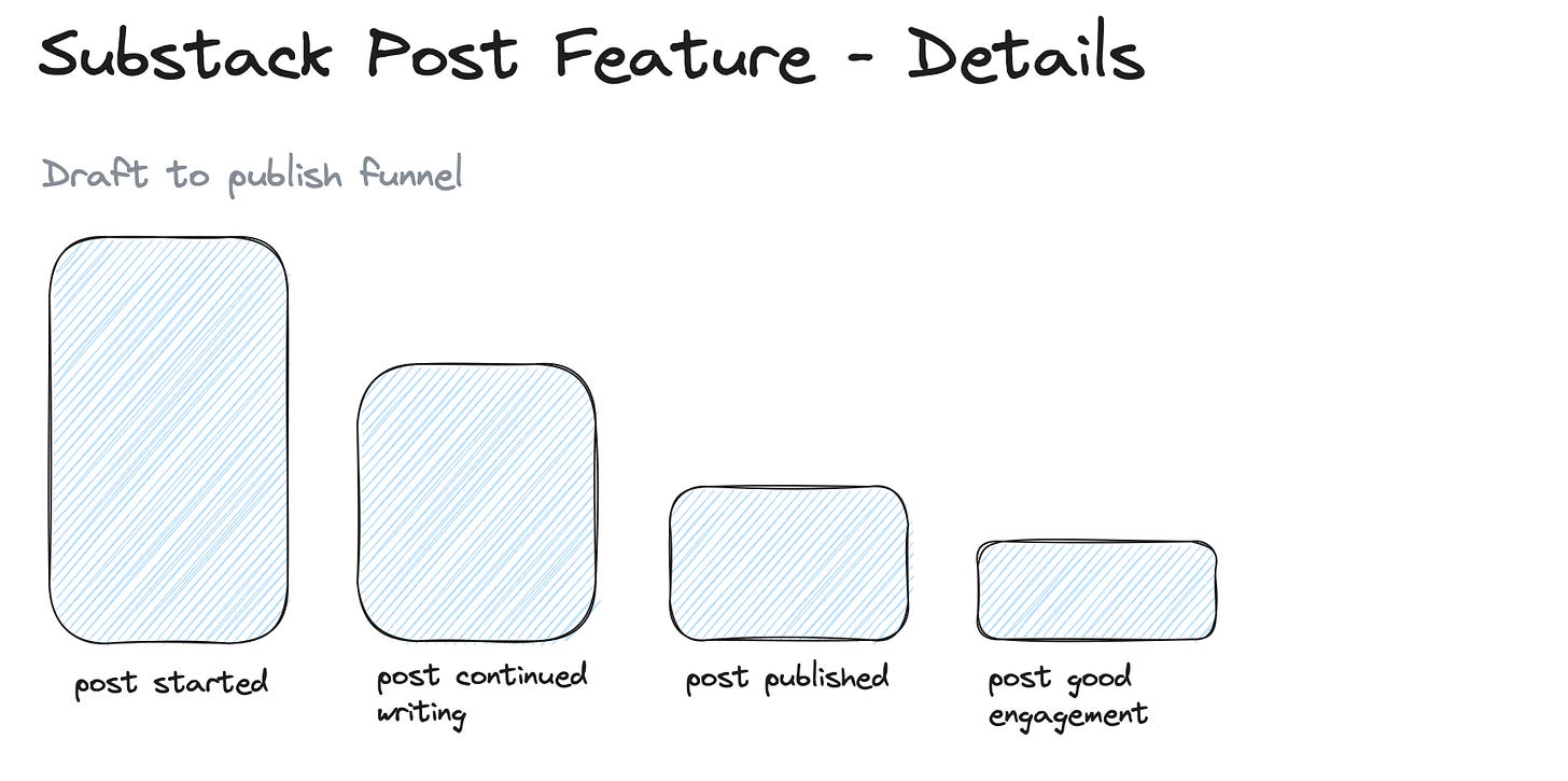
For an entity, you can then define the core activities. These activities usually represent a classic feature lifetime funnel. So for the posts, it would look like this:
The activities describe a typical post lifetime, from getting started to generating another subscriber. Here for the posts, it’s also the core flywheel. The more posts your users create, the more you grow traffic and subscribers. So the core success activity here is: “Post published”; a secondary would be “Post created subscription”.
If you sketch this out, this catalog can increase based on the depth you want to add and how many new features and activities you add.
Please go slow here since every added item is working to set up and maintain.
And we now want to add metrics and create a dashboard to monitor the performance over time.
Feature analytics
With the catalog in front of us, we immediately have some questions:
Which feature is used most by our users - an obvious and immediate question. And I also like to start my discovery from there. This will usually happen on the feature action level. The interesting design question is how deep you go with the actions. Or which activities do you pick for the analysis?
Which features are essential to convert free users to customers - now we are getting to something interesting. It is necessary to look at the number of times a feature is used. This analysis is pretty complex and always has room for interpretation. But it is beneficial to understand usage and conversion patterns.
Is the feature usage growing - it has at least two sides: total growth - not interesting for analysis, but great for PR. And relatively based on accounts - this is more interesting to see how new onboarded accounts impact the feature performance. You can create retention reports based on specific feature usage for a deeper picture.
There are at least two typical ways to do a feature analysis:
A standard feature data map or dashboard to help everyone to get a quick picture of how features are used in the product and some simple trends if things are changing.
A deep analysis of feature performance and cross-feature effects. Are specific features connected? Business questions trigger this, discovered data patterns, or sheer creativity (the core trait of all good analysts).
How to create a feature dashboard
The deep analysis depends too much on the different use cases, so we focus on the feature dashboard.
I usually create two levels of a feature dashboard. The first is a high-level overview of all core feature entities, and then a detailed one for the entity features I am currently focusing on.
The high-level feature entity overview
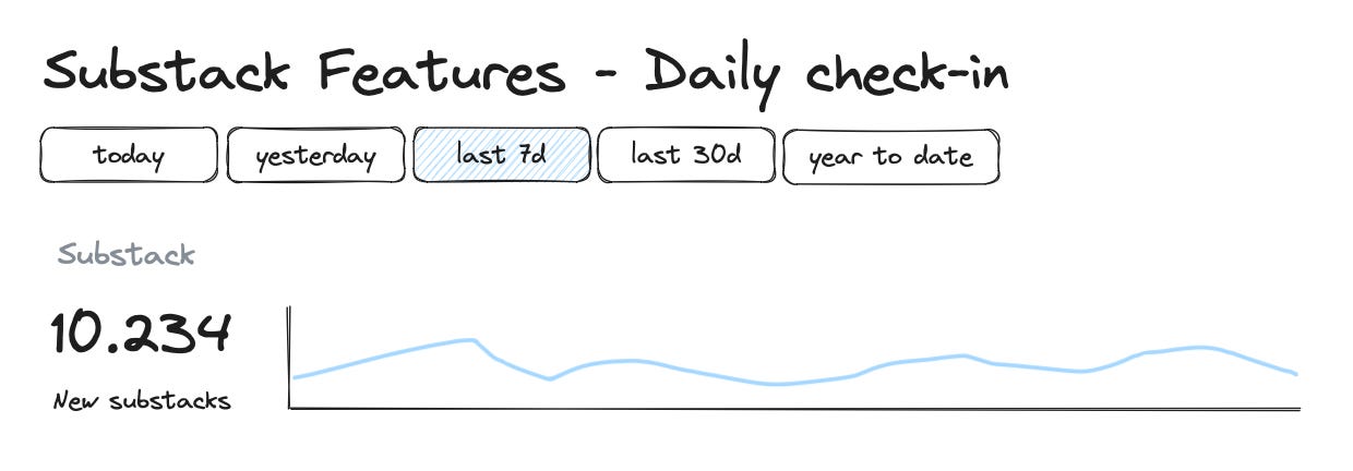
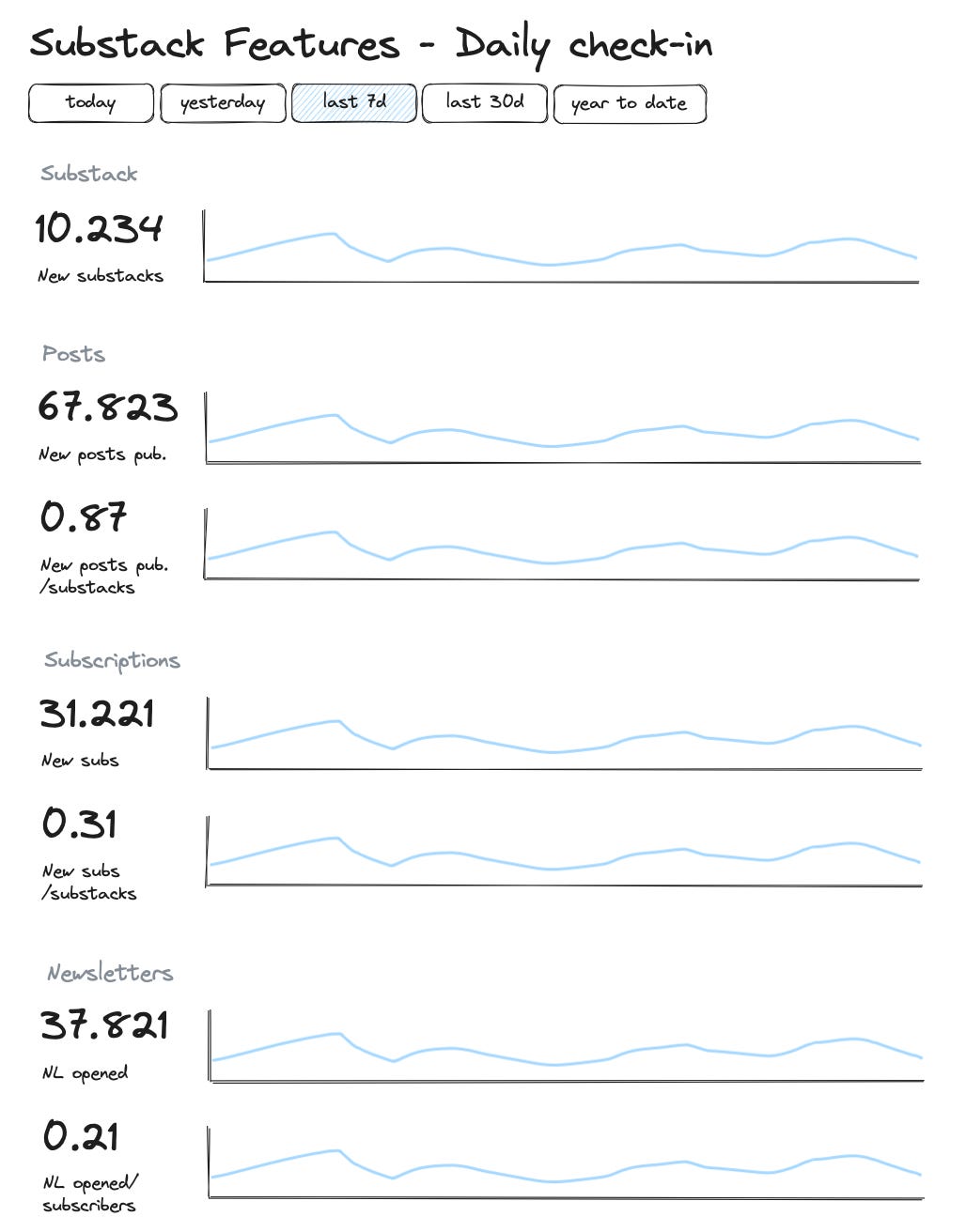
I usually create these daily check-in boards on the feature entities level for each product I work for. And I always use this structure. I add quick filter buttons to quickly click through the relevant periods (not all tools support this).
Then I combine the total number and a time series to show detailed development.
For some metrics, I like to add a relative metric that shows the total metrics in relation to a baseline total (like total Substacks):
This indicates I am growing aggressively for new Substacks, but the post frequency needs to catch up.
So for our Substack reporting, it would look like this:
Feature entity overview dashboard
Now we go one level deeper, select a specific feature entity, and create a dashboard. The charts are very dependent on the entity itself and our current focus. So there is no complete blueprint available, more a collection of different chart types I use.
If possible, I like to start with a funnel that shows an entity's lifetime with the activities. The steps depend a little bit on what I want to see. Here I might also end up with subscriptions that the post has generated. But this would be misleading. Funnels are excellent to show if steps have been done at all. So this funnel here is more interesting to see how people struggle to publish a post. So we might remove the last step in the funnel.
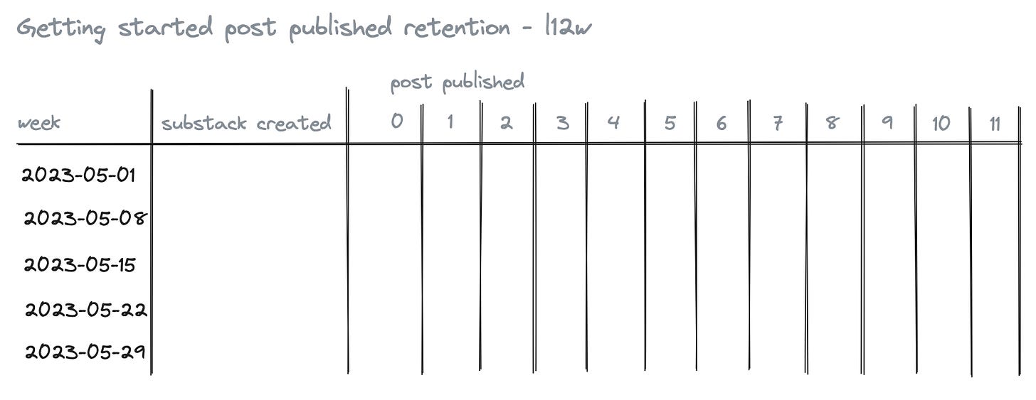
The next one looks at how we get new substack users to post regularly:
I am a massive fan of retention reports. They are flexible, and I see development and not just one-offs.
This one gives me data about how good we are at getting new Substacks to publish regularly. This is important for us to get new users into the publishing rhythm. The retention table helps me see how our initiatives are doing; we are deploying to activate new accounts right now.
But retention can do more:
This is a good check-in retention chart to see how different groups of writers do (group by publishing activity) and if we see risks that our power user groups are churning. This chart is even better when we add a second dimension to show the last five weeks, allowing us to conduct a trend analysis.
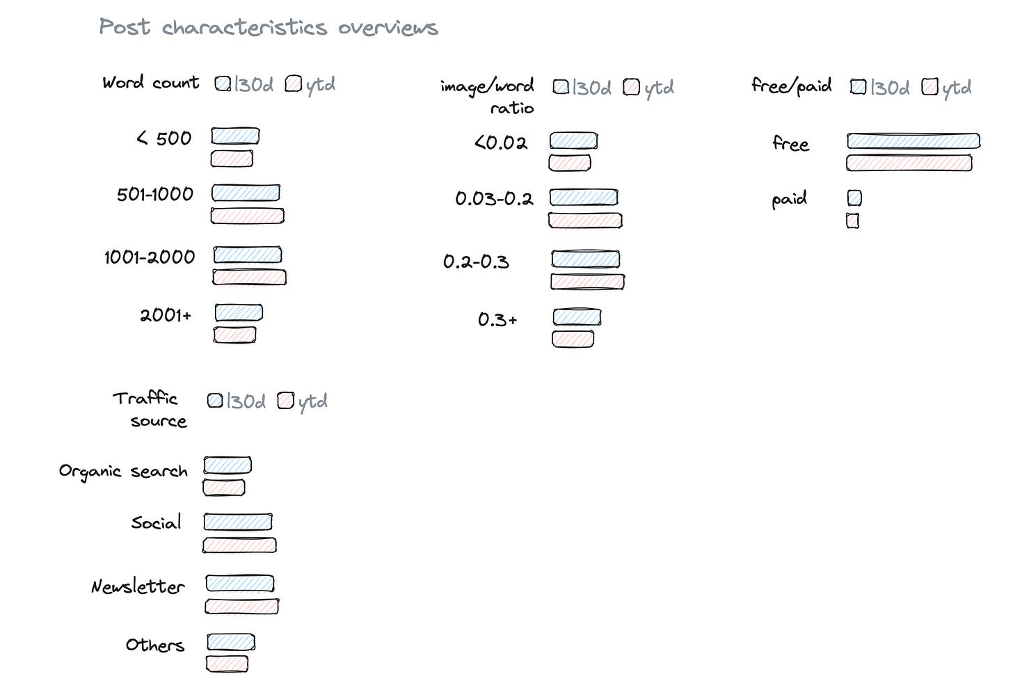
Finally, I like to add some criteria charts that show breakdowns of the product entity. This is helpful for all people working with the feature to understand how posts are split up.
As said. There is no right version of this one. These charts always represent our current focus for the product feature entity. Here the focus is on getting people to write and see the impacts of SEO.
But what if we now run different initiatives to improve the SEO impact of posts? Is that a feature or something else?
Initiative analytics
Now it gets interesting. We mentioned already that product teams are constantly working on features. But do they only develop new features? Of course not. Most of the work is the refinement and extension of existing features. Outstanding product teams are good at iterating on existing features to improve them with each deployment.
So this is different feature development and needs different kinds of data. I call these feature initiatives. Each initiative has a clear objective of what it tries to achieve to improve the feature. And based on that, we can build a feature initiative dashboard.
I am a huge fan of feature initiative dashboards and could spend most of my time just checking them. They are showing the lifeblood of product development. Ideally, the deployment of the feature initiative is done by using feature-flagging and behind an a/b test. This will get us substantially better data to work with.
We start with some context data. How is the rollout going on (assuming we use feature-flagging)? To always know what the baseline looks like.
The following part again is dependent on what the initiative should improve. If we had the initiative to get new users to post on a weekly base, we would use a retention chart here to compare users with the features vs. non-feature users.
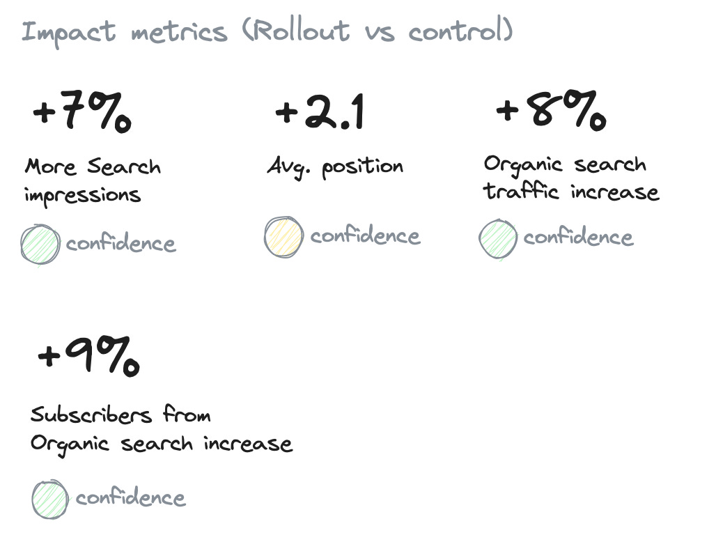
Here we need to see the impact the changes have on SEO traffic. Therefore we are comparing similar posts with the new features deployed vs. non-feature posts. And we are looking for increases in the feature-flagged posts over the old posts.
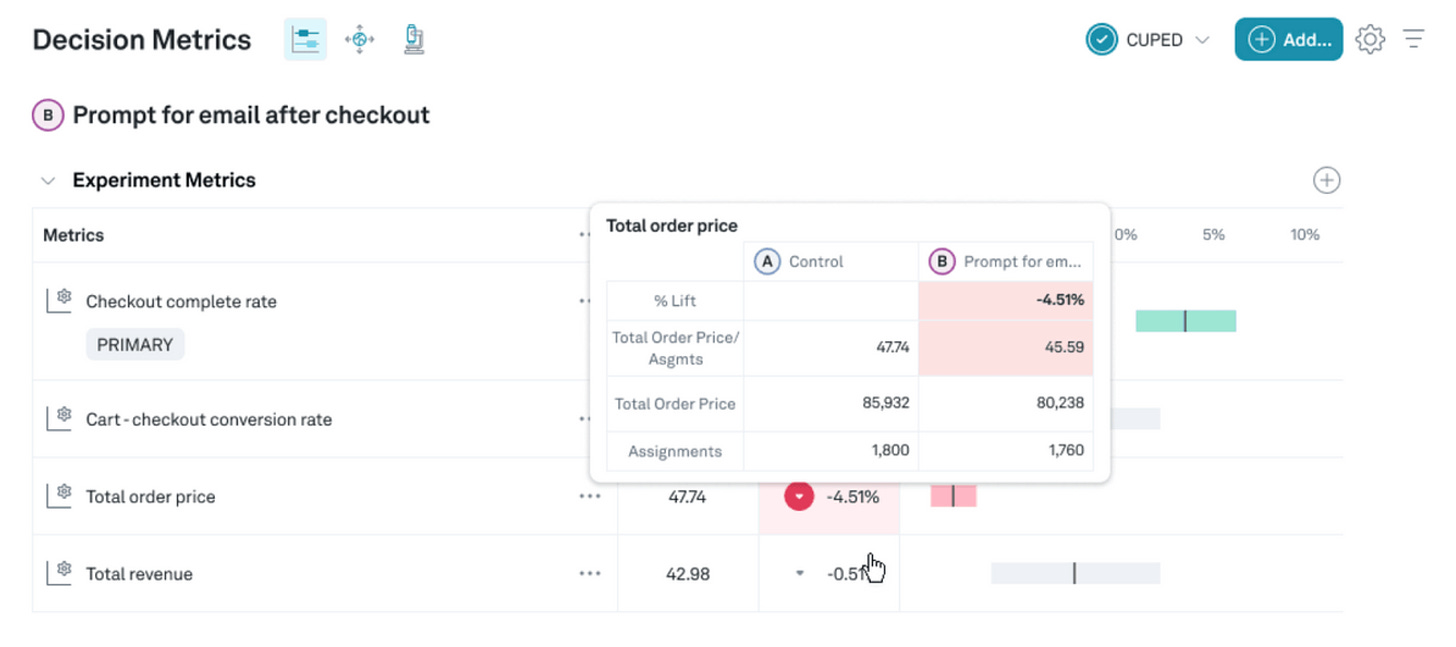
Ideally, this data comes from an A/B testing tool (I can highly recommend Eppo here).
So you could pull the confidence levels from the A/B Testing tool (to automate this is always a bit tricky).
The feature initiative report/dashboard aims to have a check-in page where everyone who worked on the initiative or whose goals are affected by it can always check how the rollout is going.
If you work with something like Eppo (I guess other A/B testing tools might support this as well), you can use their feature reporting:
Final thoughts
Feature analytics is a great way to start if you do not know what insights you should get from your product data. It is also an excellent way to consolidate things if you have plenty of different charts and analyses but need a structure for new people to see them in the right context.
I might end up with a dashboard for each feature entity, giving everyone an excellent foundation to learn how a product is used.
If you have enough event data volume for a/b testing, I would always go for feature-flagged releases. This gives you the confidence to roll out new improvements and enforces a very experimental, iterative, and data-driven culture for product development.


